Stephen and Peter Sachs Museum
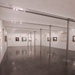
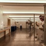
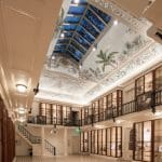
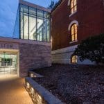
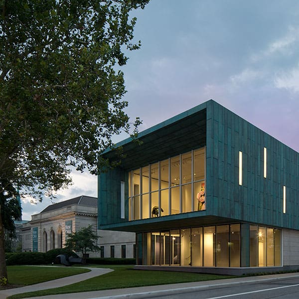
This historic museum building, constructed in 1859, had been used for many purposes, but in recent decades it stood empty. A new addition includes ADA restrooms and an elevator to bring the building up to date. The warm 2700K light for the original building intentionally contrasts with the 3500K new addition.
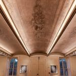
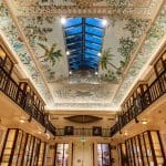
New lighting provides even illumination of the main gallery’s fabulous but oddly-shaped ceiling mural. Mock-ups ensured color and distribution of the lighting would be just right. Coordination with the restoration artist ensured excellent rendering of the mural’s colors.
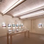
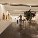
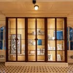
Additional galleries feature barrel vaults with uplight plus integrated track lights for the exhibits. Integral, tiny-profile LED lights solved challenges throughout the project. Careful detailing allowed lights to be concealed within cabinetry and crown molding.
The lighting is one small part of what gives this historic gem such a surprising interior.
If these walls could speak…these walls, built-in 1859…
Would they tell you about the 60,000 plant specimens Henry Shaw housed here, and then would they go quiet, remembering when Shaw’s body lay in state here?
If these walls could speak, would they brag about when they were a film studio, or would they gossip about the conversations overheard when this was a restaurant?
If these walls could speak, would they tell you how lonely it was to stand empty for three decades, or would they be excited about the architects and lighting designers who finally started coming around, doing mock-up after mock-up to get the color and distribution just right on the ceiling mural?
Would they tell you about the artist painstakingly tracing every line of the ceiling mural onto mylar – then taking a sample light fixture back to her studio to recreate the mural under the same light that would eventually illuminate it?
Well.
These walls never spoke.
But one day, they LOOKED at us. The contractor had started demolition work, and there – right above the first hole in the demolished plaster ceiling – was a FACE, looking back at him. So you see, this room, which had been destined to be a simple space with gypboard ceilings, recessed cans, and some track lights, had three hidden frescoes painted on forgotten arched ceilings! They were portraits of Henry Shaw’s friends and heroes. So this room had to be redesigned quickly; the faces had to be illuminated, and (of course) there was nowhere to mount the luminaires.
Every good project has a story. This project had so many.
Now, let me encourage you – next time you are at the Missouri Botanical Garden walking past this quiet historic museum building, take the time to go inside to see its surprising interior, and maybe, just maybe…these walls…will speak…to you.


