Back in 2015, Randy Burkett Lighting Design began the process of developing not only a new website but also a refreshed brand identity. As we were fast approaching the firms 30th year in existence, it was important that we leverage our history in creating something for the future. To best achieve that goal, we turned to Spry Digital. From the very onset of the process through to the website launch their team kept our goals at the forefront while guiding us to an end product has exceeded our expectations. We have continued to build on that success and are busy working with Spry on a number of other brand communication elements.
Telling the story of branding and web development in this post is Ken Moire of Spry.
When Spry Digital were asked to design the new web experience for Randy Burkett Lighting Design, we were thrilled to accept the challenge. Randy Burkett Lighting Design has designed lighting for some of the most prominent buildings, monuments, landscapes and public spaces in North America.
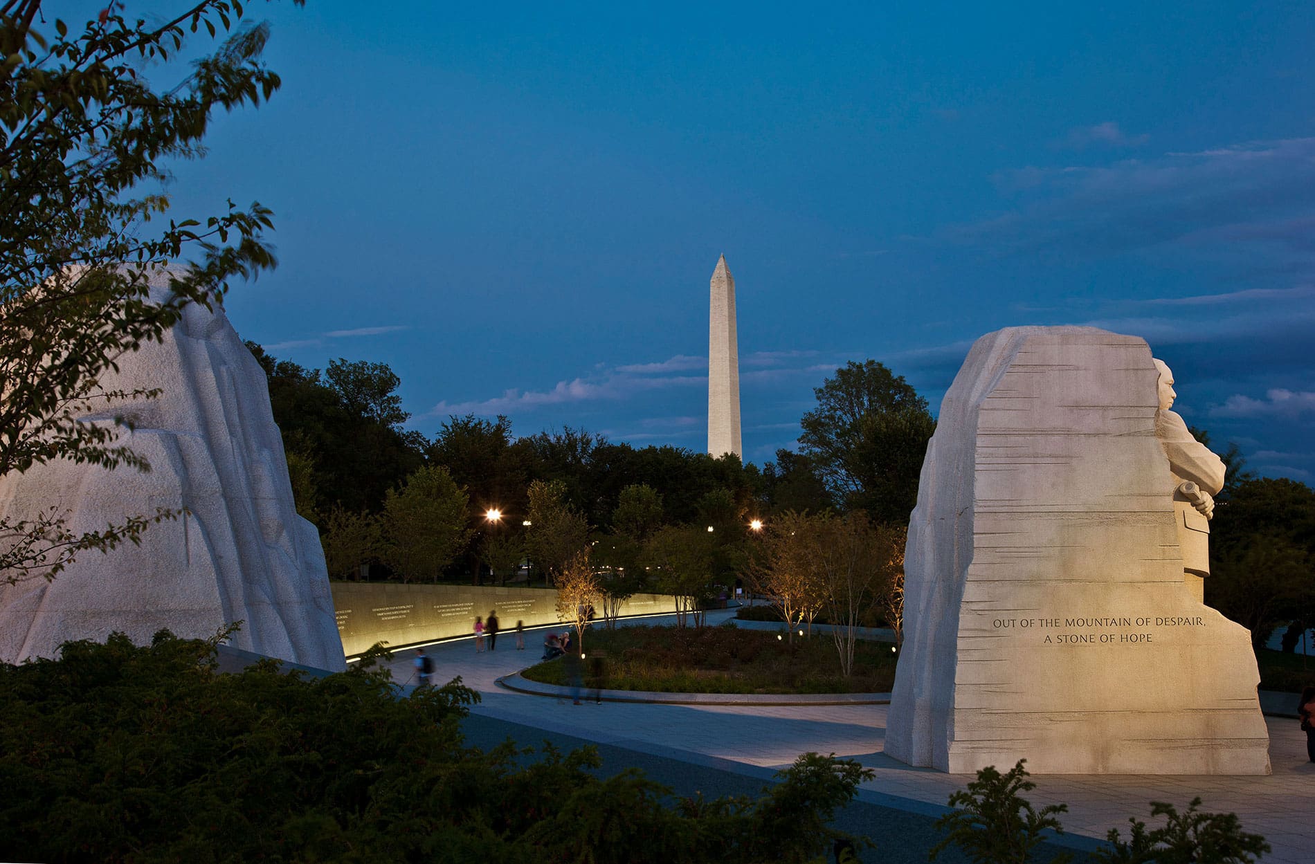
Founded in 1988 by Randy Burkett, the St. Louis-based team consists of design professionals across disciplines, with lighting related backgrounds and educations in architectural engineering, architecture, interior design, and theatre. Coming from design backgrounds ourselves, we could get to the bottom of the team’s unique digital business challenges and help them to overcome any obstacles in communicating their work, discipline and philosophy to a wide audience.
The Challenge
Randy Burkett Lighting Design’s previous website was minimalistic and featured content that was tidy but small. Like many websites of the time, the site had been designed for screens less than 1000px wide and was not responsive. The content was high on aesthetic, but void of brand messaging and calls-to-action. The copy required an industrious attention from the user to read and synthesize what the firm had to say about their own work and practice.
The site was not built on a modern content management system (CMS), so was difficult to maintain and update, and did not provide scalability to grow with the firm as their work examples and content needs did.
Goals of the new website:
- Design a responsive web experience that works and functions across all screens sizes and device types
- Build on a modern, easy to use CMS that is scalable and can grow with organization
- Design layouts that make full use of web canvas to highlight work
- Build the site on an SEO-friendly platform
- Incorporate a blog where the client can express their culture and work
The team at Randy Burkett Lighting Design was quick to point out that while many of their partners include those in the architecture field, key decision makers and stakeholders on projects range from architects, building managers, interior designers, landscape designers and other non-design professionals. Thus, the primary content goal was to showcase the high level of expertise in their field, while making the content accessible to a range of audiences and not appear overly aloof – it needed to appeal to individuals from the technical and visual design field, as well as those who were not.
Spry Digital began work by conducting stakeholder meetings with the principals and staff – understanding their business, their approach, how they represent their work – to begin developing the content strategy. One of the first areas on which Spry focused was the Randy Burkett Lighting Design brand itself: How has the brand historically represented the firm and how can the brand accommodate the future?
Visiting the Brand Identity
Spry Digital considers every decision for our clients through the lens of a user interacting with the brand. We spent time with the client to understand how the brand identity was used in communication pieces in the past, and how the brand is represented and perceived today. After evaluating the identity, it was agreed we would begin by updating the brand identity to represent what Randy Burkett Lighting Design is today.
Legacy vs Future
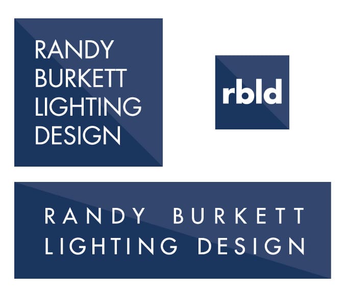
The client’s previous wordmark logo included a stacked and justified Old Style typeface. While an elegant treatment, it did not necessarily speak to the to modern practice of lighting design. Since their existing logos enjoyed some familiarity with their audience, we wanted to remain loyal to the original mark, yet bring it forward with an updated typeface and treatment.

During the design process, Spry explored a variety of logo treatments – from variations of the old logotype to more abstract interpretations. The result was a primary logo that remains loyal to the original layout with a more contemporary typeface and background treatment. The 45 degree two tone background is evocative of a ray of light, hinting at the practice of bringing out nuances in the form that good lighting design achieves.
Setting the Stage
Since the brand identity would typically be presented with visually striking imagery of lighting plans, architectural drawings and finished projects, we decided on a limited palette of purple and dusky hues, akin to a midnight blue sky, a time of day that reveals the true magic of lighting design. The primary and secondary colors of the brand are complimentary to all creative assets, ranging from exterior landscapes, to building facades and interiors.
Creating a Brand System
With the primary logo revealing itself in the process, we then addressed the multiple uses of the brand identity across medium.
Randy Burkett Lighting Design requested specific strategy around the fact the firm is often referred to as RBLD. We designed a version of the mark with the four letter forms against the same background, knowing this treatment would work well as a watermark on project images, presentations, and social media. For additional flexibility, we created a horizontal version of the full wordmark. Both the abbreviated and horizontal versions are used on the two sides of the business card, while the stacked wordmark is used on the website.
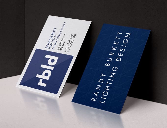
Spry Digital continues to work with Randy Burkett Lighting Design to extend the brand into marketing, sales and communication pieces.
Website Planning
With the brand identity exercise underway, Spry Digital got to work on planning the new website experience.
Architecture and User Experience
We took the information presented in the initial stakeholder meetings and began the process of documenting the requirements for the new website. We created an information architecture diagram that began to inform the areas of the site and the audience’s journey through the new web experience with navigation.
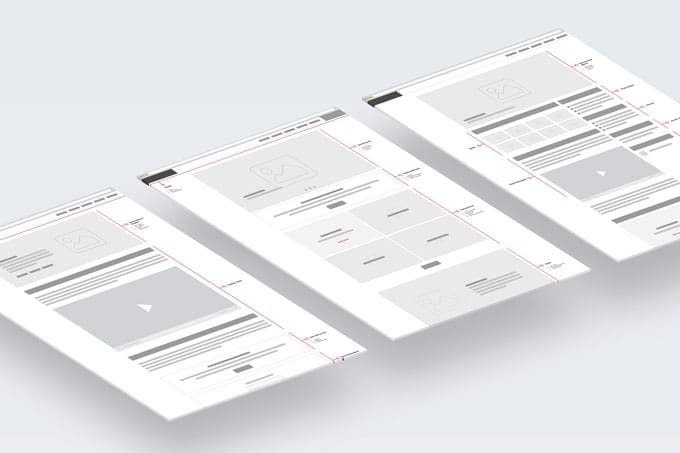
Wireframes were developed that would begin informing the layout of the site and specific content. At this stage, we are thinking about the user’s experience and priorities, and consider how we express who Randy Burkett Lighting Design is to somebody who lands on the website, their unique value proposition, what it’s like to work with the firm, and how to reach out.
We designed multiple areas on the home landing page that draw users into inside landing pages for those areas, including featured work, work examples, latest blog posts, about the studio, and a prominent call to action to reach out them, assuming a visitor has already been wowed by the beautiful work. We are also thinking about multiple audiences and what they might want to see when they land on any area within the website.
With the user experience portion of the planning done, we set forth on visuals, defining the aesthetic look and feel of the new website, borrowing brand direction from the brand identity exercise.
Defining the Visual Language
For the visual design of rbldi.com we considered how the website form, as well as any user interactions on the site, would translate between mobile and desktop, or any other device for that matter. Thinking about these different devices up front informs a more comprehensive design, consistent user experience, and functionality across devices.
The visual design employs a magazine/editorial layout in its presentation. We created multiple versions, taking into consideration multiple font and color treatments. We were sure to make use of the phenomenal photography owned by RBLD with oversized areas, showcasing details of their work previously not seen by making full use of the web canvas.
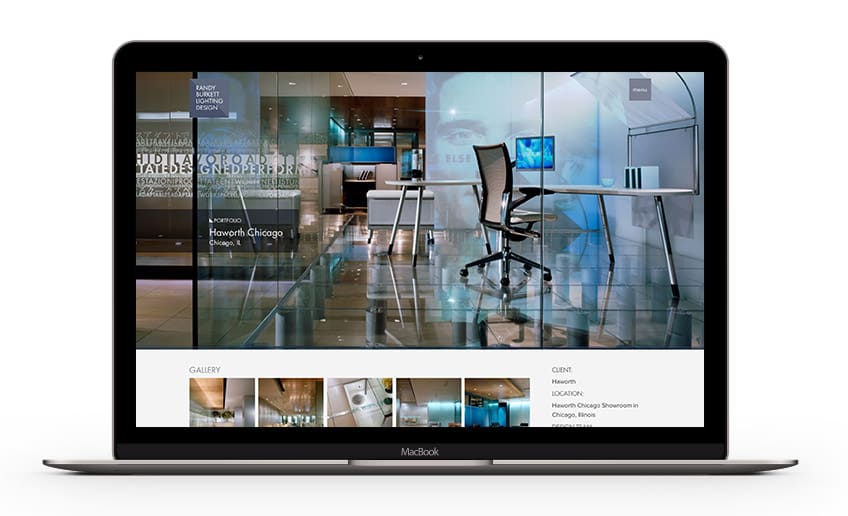
Brand extension comes in the way of angled overlays in different content areas – the blog, studio, and calls to action – carrying the theme of the logo through to the website interface.
Micro-interactions – a unique “off canvas” navigation, hiding the traditional masthead so not to conceal the beautiful examples of work, and animated hover states on work thumbnails – were included in the design to create an enticing experience, encouraging discovery and interaction.
By the end of the visual design phase, we felt we achieved a balance of design aesthetic and practical data that would satisfy all audiences no matter their background.
Bringing it to life
The new website was built on the WordPress content management system (CMS). WordPress is the most popular open source CMS platform in the world, and could be easily managed and maintained by Randy Burkett Lighting Design.
Other features of the new website include:
- Featured work masthead on home page that randomizes on every page load, giving the site a fresh look on every visit
- Customizable area on home page for Randy Burkett to push announcements
- Off canvas navigation
- Portfolio area organized by industry
- Cross-related portfolio projects and services to encourage further discovery
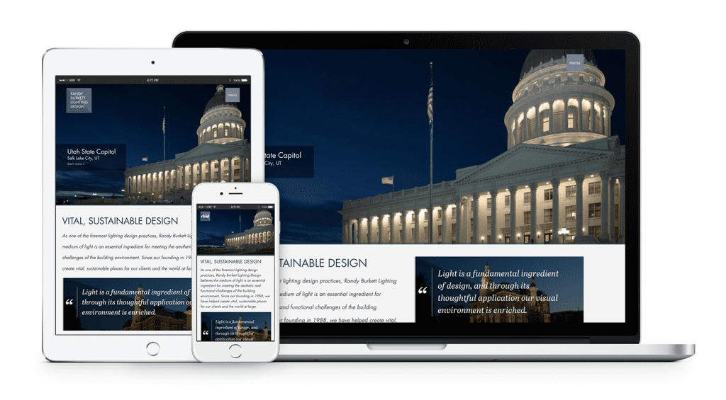
Spry Digital tested the website on most popular screen sizes, operating systems and devices to ensure a consistent experience for every user.
Results
The new Randy Burkett Lighting Design web experience delivers on the goals defined at the offset of the project and presents the firm’s work and philosophy in a new light.
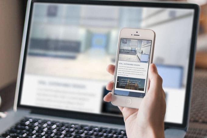
Since its launch in September, 2016, Randy Burkett Lighting Design has reported dozens of new leads generated by the website, and continues to receive positive praise from partners for the new brand identity and website.
Reviews
Founder/Principal Randy Burkett had this to say about working with Spry:
“The Spry team expended a significant amount of up-front time getting to know our design practice and philosophy, before embarking on the website and rebranding effort. The time spent proved invaluable throughout the entire process, as they were able to better anticipate our needs and meet expectations.
As design professionals ourselves, we chose to remain closely engaged with Spry during the development and rollout. They were always accommodating and worked responsively, while using their knowledge to keep us on track to our goals. They were the experts and it was their insight that ultimately led to a successful project for us all.”
Ken Moire is a founding partner at Spry Digital, a nimble digital agency in St. Louis. He has over 16 years experience in branding, marketing and interactive design. Spry Digital was founded in 2010, with the goal to build holistic and impactful digital platforms for business. Learn more at sprydigital.com